
This article is one in a series of ‘Lab Notes’ — experiments in local TV news innovation implemented at the ASU Walter Cronkite School of Journalism, supported by a grant from the Knight Foundation.
“I suppose it is tempting, if the only tool you have is a hammer, to treat everything as if it were a nail,” observed Abraham Maslow, the psychologist best known for developing the ‘hierarchy of needs’ to explain human motivation.
News directors looking to transform their local newscasts may want to stop hammering away with the same story and show formats, and instead switch to a more versatile tool. Content that’s more like a multi-use Swiss Army knife, and less like the repetitive, predictable pounding of hammer and nail.
Over the past few months, the students and faculty in the Cronkite newsroom at the ASU Cronkite School of Journalism have experimented with story and show formats in hopes of creating ‘Swiss Army knife’ content — content that both reinvigorates the current broadcast news format but also can thrive on the digital and social platforms where audiences increasingly choose to get their news.
We focused on key pain points for local newscasts: the predictability of the half-hour format and standard reporter packages; the fact that the primary content elements of a newscast — voice-overs, ‘VO-SOTs’ and short reporter-fronted packages — don’t translate or perform well on the other social and digital platforms today’s news consumers use; and the challenge of finding ways to create new formats in resource-strapped newsrooms busy programming hours of live shows per day.
With those challenges in mind, we engaged in three types of experiments:
- making ‘video-poor’ stories more visually compelling
- changing the look, feel and story formats to make the newscast more engaging and less predictable
- creating content that could work both in the newscast but also cross-platform
Along the way, we looked for opportunities to increase the number of people in the newsroom who could contribute to content creation. Here are three experiments we tried — explainer videos, narrative packages, and via in-depth ‘spotlight’ segments — and what we learned.
Explainer Videos
In my years in local newsrooms, I remember stories being shot down in the morning meeting countless times because they were ‘video-poor’: important, but hard to visualize. Some called them ‘newspaper stories.’ In the new news ecosystem, where the local newspaper may be gone or gutted, those important stories still need to be told. So we set out to experiment in the Cronkite newsroom with ways to visualize these complex and video-poor but important topics.
We found our inspiration on YouTube, where “explainer” videos have thrived for years. I found the ‘whiteboard’ and ‘animation’ videos especially eye-catching and effective for breaking down complex topics. Why couldn’t this popular digital format also work within a newscast?
We did some research, compared product reviews, and settled on a DIY animation tool called VideoScribe by SPARKOL to simply and quickly create animated explainer videos. The tool includes a rich library of images and objects. A storyteller simply picks the objects, puts them in a sequential timeline, types in any desired text, and the tool does all the animation drawing automatically.
We first used VideoScribe to put into context the relative risks of air travel in the immediate aftermath of the grounding of the Boeing 737 Max airplanes.
We also used this method as part of our coverage of the Green New Deal movement, to explain whether giving up eating beef would really impact greenhouse gas emissions.
Then we create an animation to explain the concept of ‘Herd Immunity’ as part of an in-depth set of stories on vaccination rates in Arizona.
(Explainer starts at 6:22)
It’s been great to see this method quickly adopted elsewhere. In Spokane, KXLY used VideoScribe to explain a local school funding issue, days after seeing our Cronkite experiments. Here’s our story on the video explainer KXLY created.
We found that the ideal workflow was to use a standard storyboard script format, with one column for the anchor/reporter narration, and the other column for the companion visuals.
These animations not only gave our traditional newscast a fresh-looking story format and helped visually explain complex issues; this story format also works just as well as a social video or on digital platforms like the news website or YouTube — so it’s truly multi-platform content.
Videos without Video
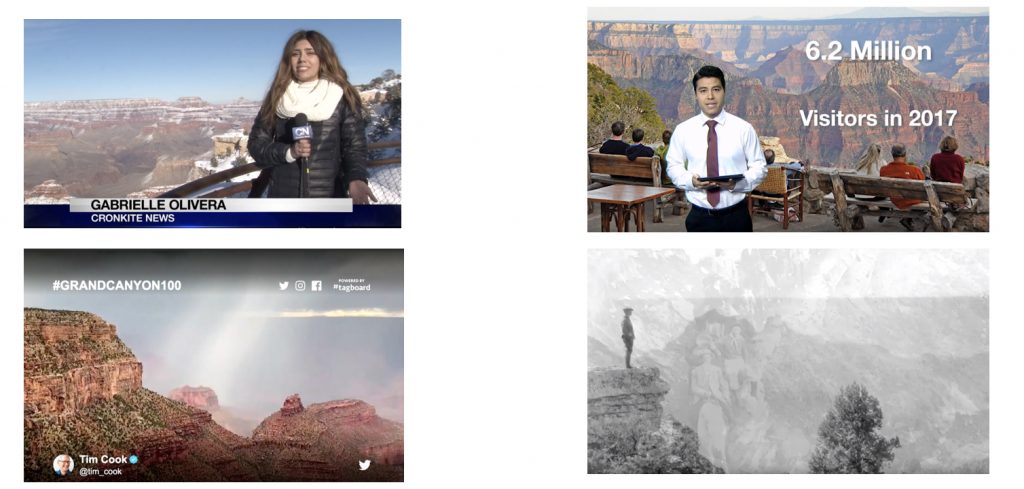
On our Grand Canyon Spotlight segment, we also explored another format: a video with no video elements. Our inspiration was Ken Burns and his distinctive, compelling approach, which often relies solely on artwork and photography. We sought out the best ‘voice’ in our newsroom; we recruited a member of the digital team to research the best free photography of the Grand Canyon via government and creative commons websites; we collaborated on the writing and found one of our best editors. The result was a micro-documentary on the history of the Grand Canyon that visually relied solely on photography. No crew left the building. We used resources already in the newsroom. The story stood out within the broadcast. Yet it was also ideally optimized for digital and on-demand news consumers.
As with explainer videos, we simply took a story format that digital audiences have already embraced and incorporated it into the broadcast format. In addition, the production process resulted in a collaboration among ‘specialists’ who would not normally work together, each contributing a Marvel ‘superpower’ to create a story none could have done well alone; and all while not impacting our daily reporter resources.
Spotlight Segments
A common criticism of local TV news is that it lacks depth. So we set out to create ‘super-blocks’ – full segments of the newscast devoted to a deep dive into a single topic. We also challenged ourselves to utilize varied storytelling techniques, including ‘by the numbers’ data visualizations, interactive maps, the explainer videos and narrative story formats described above, and more. We restricted ourselves to airing only one ‘traditional’ TV package, and the producers went out of their way to avoid the traditional anchors-on-set look. The goal was to create in-depth content on a single topic. We hoped the outcome would be long-form video that not only worked in the newscast format (without looking like a newscast) but would also perform well on digital platforms.
We created three of these in-depth ‘Spotlight’ segments over the course of three months. The first was tied to the 100th anniversary of the Grand Canyon, the most visited destination in our Arizona coverage area. We did have one traditional reporter package covering current issues facing the park. But we enhanced and diversified our coverage with a ‘by the numbers’ story with key stats, presented not on the news set but by using a green screen; the mini-doc narrative described above telling the history of the canyon using only narrated photography; and a user-content powered segment where we used Tagboard to curate the best viewer images and stories of trips to the Grand Canyon.
We did two more of these Spotlight segments. One focused on wildfire season. The other, on vaccination rates in Arizona, was 12 minutes long — the entire ‘A block’ of the broadcast. The show began with an anchor at an interactive map, showing vaccination rates in key parts of Arizona; next was an enterprise package exploring why some Arizona counties have such low vaccination rates (this was significantly longer than a traditional package — nearly six minutes in length); then we produced the animation described earlier to explain “Herd Immunity.” We concluded the Spotlight coverage with a report on a special set summarizing each of four pieces of legislation proposed in Arizona to address the issues, and a short Q & A with the anchors and the reporter who led the investigation.
Future-Proofing Your Content
The unifying theme for these three content experiments was that they each produced content that gave a fresh look and feel to the daily newscast; yet in each case the content was formatted to work just as well on other screens, and for on-demand and long-tail as well as daily audiences. These approaches also led to greater collaboration and leveraged additional storytelling resources within the newsroom.
When time and money are scarce, it doesn’t make sense to keep hammering away at tired formats. Aiming innovation resources at ‘Swiss Army knife’ strategies can create content that work both for the platforms of today and tomorrow.
More experiments from the Cronkite News Lab:
For more ideas and examples on story and show format innovations from the Cronkite News Lab, check out our interactive “Choose Your News” live newscast; and our ongoing effort to improve transparency and trust via “Full Circle” storytelling. For examples of how technology and partnerships can help drive newsroom transformation, see our tech partnerships case study.